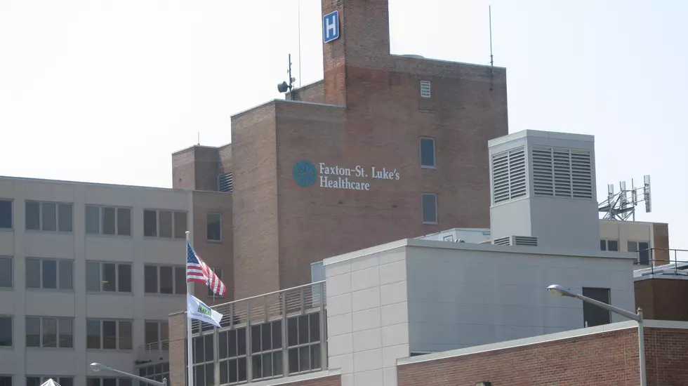
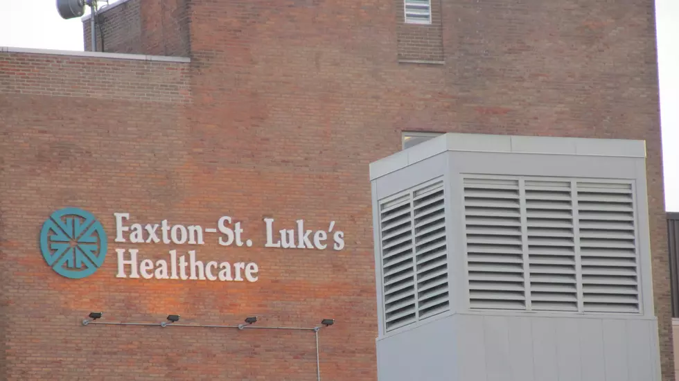
Mohawk Valley Health System Launches New Brand And Logo
Mohawk Valley Health System is unveiling a new brand and logo that focuses on the next generation of healthcare in the region.
The new brand was developed based on input from MVHS employees, medical staff, the Board of Directors and the community.

President and CEO Diane Stromstad says the new brand and logo creates a contemporary look to reflect a new state-of-the-art hospital, incorporates bold colors which reflect strength, transformation, health, trust and hope and visually connects MVHS and the Wynn Hospital.
Stromstad explained the significance of the shapes and colors in the new MVHS and Wynn Hospital logos.
PURPLE MOUNTAIN
This speaks to the majesty of the Adirondacks and our entire region. Purple represents strength, transformation, power, and royalty
LIGHT BLUE RIVER
The river reflects the historical significance of the Mohawk River and the Erie Canal and to the growth of this country by opening up the West. Light blue represents empathy, compassion and path to growth.
GREEN MOUNTAIN
This mountain reflects the Mohawk Valley’s robust agriculture industry. Green represents the color of health and hope.
DARK BLUE LETTERING
Our acronym – MVHS – is recognizable to the whole of Oneida and Herkimer county. The dark blue of the lettering represents trust and loyalty.
“It’s an exciting time for both our region and our healthcare system,” said Stromstad. “We are moving to the next generation of healthcare in the Mohawk Valley. The launching of our new brand today is another step in our journey to transform healthcare from excellent to exceptional. We are looking forward to the future with hope and optimism as we strengthen and grow our services to meet our community’s healthcare needs.”
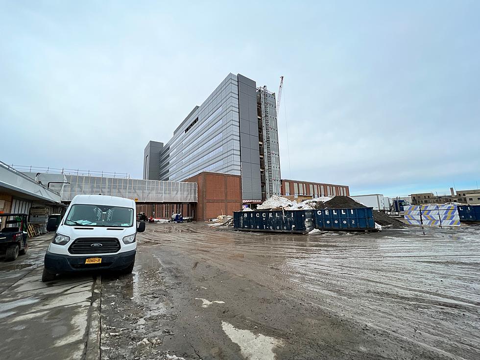
The Wynn Hospital is scheduled to open in downtown Utica in 2023.
Wynn Hospital at MVHS Construction Tour in Utica, NY
Gallery Credit: Bill Keeler
Go Inside Old Charlestown USA Mall
Gallery Credit: Credit - Polly McAdams
13 Obscure and Tiny New York Towns
Gallery Credit: Dave Wheeler
More From Lite 98.7