How Much of Central New York the California Wildfires Would Cover
To put in perspective just how large the recent California wildfires really are, Jeremia Kimelman and Joe Murphy from NBC News designed an interactive map that allows you to compare the size of the three main wildfires--Camp Fire, Woolsey Fire, and Hill Fire--to any area on a U.S. map.
Using NBC's technology, we applied the largest fire, known as Camp Fire, to portions of a Central New York map. The enormity of the fire really hits home when you can picture it covering an area of familiarity. Here's how the Camp Fire would look compared to specific regions of CNY:
Spanning from Utica to Rome:
Matching the size of Fort Drum's military base:
Engulfing much of the Syracuse metro:
Covering most of Oneida Lake:
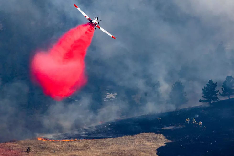
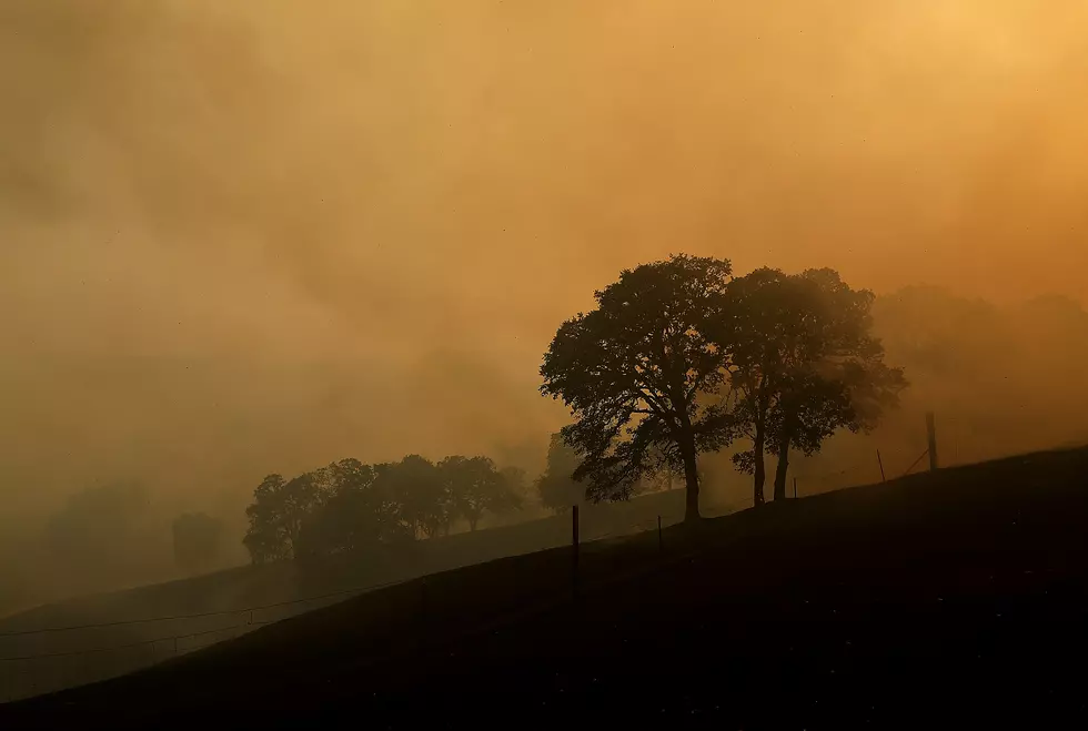
Since November 8th, the blazes have become the most destructive in California history, burning over 300,000 acres, leaving dozens dead, and over 100 still missing.
More From Lite 98.7